
Botanikos
A premium e-commerce site for a botanical wellness brand. The design problem is positioning: a structured product grid and nature-forward dark aesthetic that signals price tier before the first product page loads.
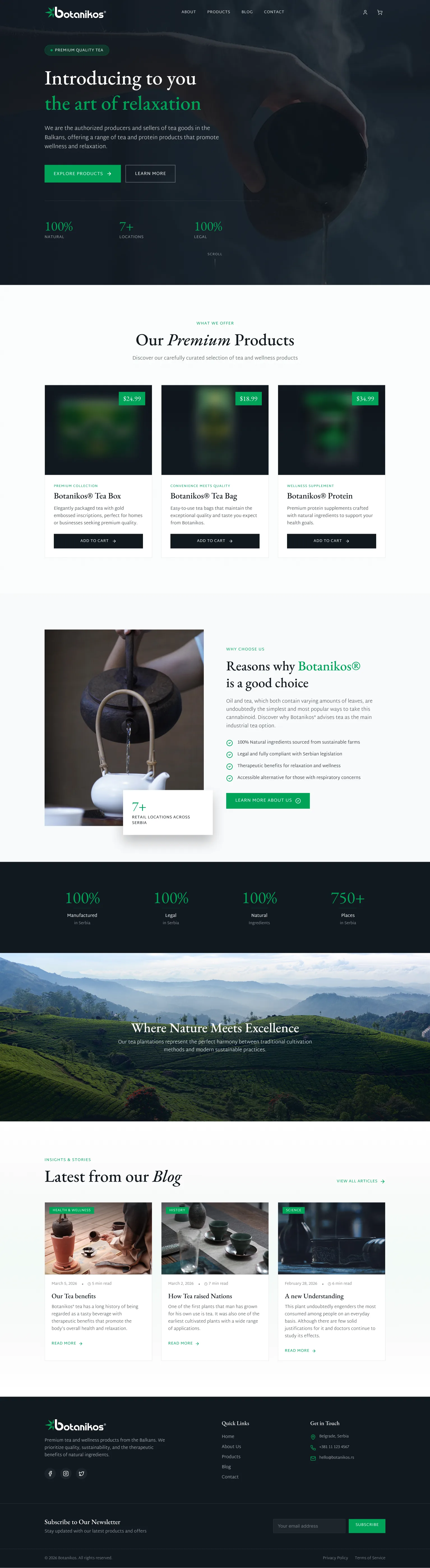
Botanikos produces premium botanical teas and wellness products with genuine quality differentiation, but their online presence didn't communicate it. In a crowded wellness market, generic design was erasing what made the brand worth choosing.
Most wellness brands use the same playbook: clean white space, generic product photography, and safe typography. Nothing signals why Botanikos is worth choosing over the shelf next to it. The nature-forward, artisanal brand story was invisible online.
Build a premium e-commerce site that communicates "Where Nature Meets Excellence" on first load, structures the three product lines with clear hierarchy, and builds trust before the purchase decision through quality signals and brand storytelling.
Competitive analysis
I audited four wellness and botanical brand archetypes to map where the category consistently fails to communicate premium positioning, and where Botanikos could credibly stand apart.
Whittard of Chelsea
Heritage brand with strong retail presence. Leans on legacy and volume, which communicates history but not artisanal quality. Feels institutional rather than premium wellness.
TWG Tea
Genuine luxury positioning with gold accents and high-end photography. Strong visual language, but positioned at a price point that would feel inaccessible to Botanikos's audience.
David's Tea
Accessible and cheerful, built for volume and variety. The bright, casual aesthetic signals the opposite of premium; quality claims get lost in the visual noise.
Generic WooCommerce
The default for small wellness brands: white background, a grid of thumbnails, a basic header, a checkout. Functional but forgettable. Price becomes the only differentiator.
| Criteria | TWG Tea | David's Tea | Generic WooCommerce | Botanikos |
|---|---|---|---|---|
| Premium visual language | Yes | No | No | Yes |
| Approachable positioning | No | Yes | Neutral | Yes |
| Nature / brand storytelling | Partial | Partial | None | Central |
Premium, considered, and calm
Desktop
Full site view at 1440px, botanikos.com

Mobile
Responsive layout at the phone breakpoint
Deep greens, earthy dark tones, and botanical imagery create an environment that feels like the brand: calm, considered, and premium. The palette communicates quality before a word is read.
Three product lines, presented with clear hierarchy and consistent visual treatment. Customers can orient themselves and reach the right category without friction.
A dedicated "Reasons why Botanikos is a good choice" section positioned between products and checkout, addressing hesitation before the purchase decision is made.
How it came together
Brand positioning
Identifying what "premium botanical" means in a wellness market where every brand claims natural. The answer: restraint, depth, and a visual language that feels earned, not marketed.
Visual design
Dark nature palette, refined typography, and botanical photography. An aesthetic that evokes the product experience: calm, intentional, elevated above wellness category defaults.
UX architecture
Hero → Products → Why Botanikos → Quality Stats → Blog. A sequence that builds desire first, addresses doubt second, and provides ongoing brand content.
Build & launch
Fully responsive e-commerce front end, fast-loading product imagery, smooth category navigation, and a blog architecture designed to grow organically.
Impact
Product lines clearly categorised, each with its own audience and visual identity
Client's product standards surfaced as brand proof before a purchase decision is made
Completed and delivered, mobile-first, with an editorial blog driving organic reach
Botanikos now has a digital home that earns trust before a product is added to cart. The nature-forward aesthetic differentiates the brand in a saturated wellness market, and the structured product architecture makes discovery effortless, from first visit to repeat customer.
Twimyo →
A two-sided workspace booking marketplace homepage built to convert both remote professionals and hosts from a single scroll.