
Twimyo
A workspace booking marketplace needed to simultaneously serve two audiences: remote professionals looking for space, and space owners looking for bookings. One design had to win both.
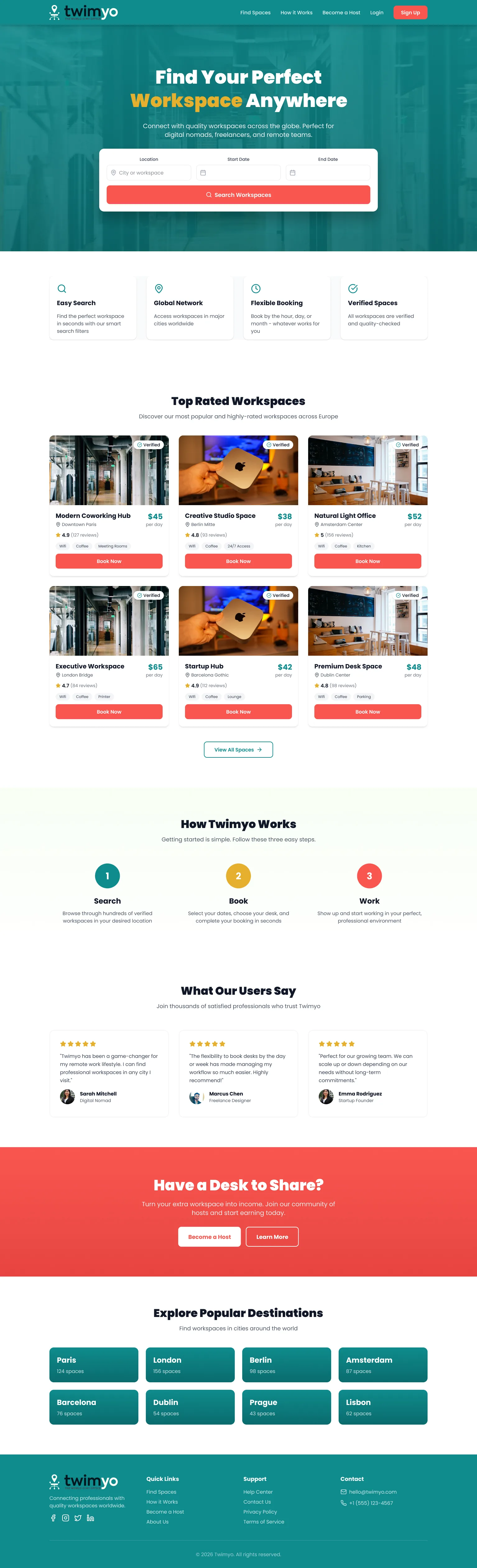
Marketplaces are hard to launch because both sides need to see value before committing. Freelancers won't join if there aren't spaces. Space owners won't list if there aren't bookings. The homepage had to sell both simultaneously, without feeling fragmented.
Most marketplace homepages choose a side and build for it, leaving the other half of the equation to figure it out alone. A workspace site that only speaks to renters loses space owners; one that leads with "list your space" loses the demand side. Neither converts effectively.
Design a two-sided marketplace homepage that converts both demand (professionals seeking space) and supply (space owners seeking bookings) from a single scroll, without either audience feeling overlooked.
Competitive analysis
I audited four workspace and flexible office players to understand how they navigate the two-sided marketplace problem: attracting both professionals who need space and hosts who supply it.
WeWork
Strong brand recognition and premium positioning, but WeWork operates company-owned spaces, not a peer-to-peer model. The supply side is internal, so the two-sided marketplace tension simply doesn't exist for them.
Regus / IWG
Enterprise-focused flexible office network with strong location coverage. The homepage leads with location search, which works for the demand side, but the brand feels transactional rather than community-driven.
Coworker.com
A directory model that lists spaces but doesn't fully own the booking experience. Functional but generic: search, click, contact. No trust-building for hosts and no urgency signals for renters.
Breather
Focused on short-term meeting rooms with a clean booking experience. Supply is company-controlled. Well-designed but narrow: no peer-to-peer supply mechanism means hosts with underused desk space have no path in.
| Criteria | WeWork | Regus | Coworker.com | Twimyo |
|---|---|---|---|---|
| Two-sided marketplace | No | No | Partial | Yes |
| Host acquisition CTA | No | No | Partial | Yes |
| Search-first demand UX | Yes | Yes | Yes | Yes |
One page. Two audiences. Zero confusion.
Desktop
Full homepage view, twimyo.com

Mobile
Responsive layout at the phone breakpoint
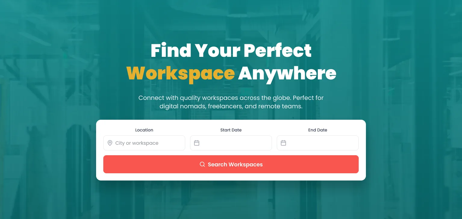
Marketplace homepages that open with brand copy ask users to read before they act. The Twimyo hero inverts that: location, start date, and end date are the first interactive elements a visitor sees. The product begins before the pitch does.
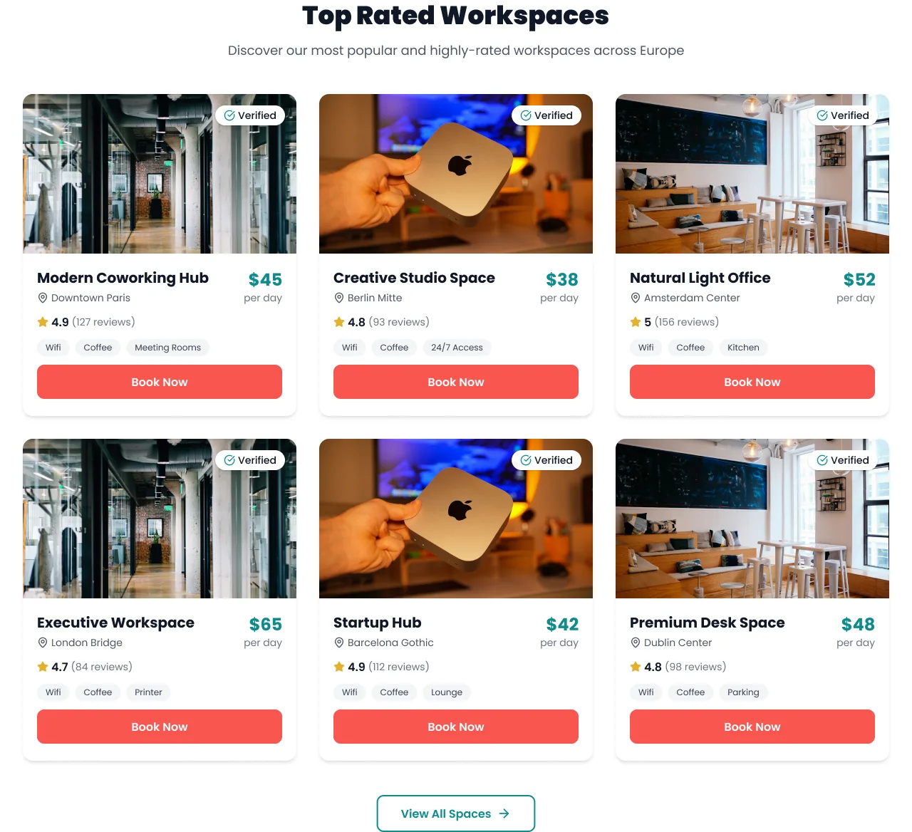
A freelancer's first question is not whether spaces exist, but whether they can be trusted. Each card answers that without a click: verified badge, city, star rating, daily price, and amenity tags.
The supply-side CTA arrives after the demand journey ends, not embedded inside it. A distinct coral palette creates a visible register shift without breaking continuity for either user group.
The design resolved

How it came together
Two-sided market strategy
Mapping both user journeys before a pixel was placed. The demand side needed to feel instant and trustworthy; the supply side needed to feel lucrative and simple. Same page, different emotional arcs.
Search architecture
Location autocomplete, date range picker, and smart filters designed to make the search feel as fast as it is, with Easy Search, Global Network, Flexible Booking, and Verified Spaces as trust pillars beneath the hero.
Trust & social proof
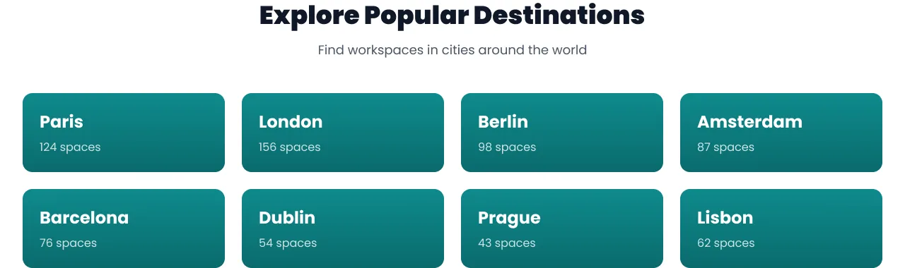
Three user testimonials from a digital nomad, a freelance designer, and a startup founder, each representing a core segment, plus a destinations grid acting as a trust map of where the platform operates.
Dual CTA build
A host acquisition section designed with its own visual identity, clearly separated from the demand-side experience, with a footer closing the trust loop for both audiences.
Impact
Audiences served from a single, uninterrupted homepage, with neither the renter nor the host a secondary consideration
European cities in the destination grid, each with a visible space count
Self-initiated, with no client brief or production deployment, just the two-sided marketplace problem and one page to solve it
The homepage solves what most marketplace templates avoid: two audiences, one scroll, no compromise. The freelancer gets a search-first experience built for urgency; the host gets a separate visual register that feels deliberate, not bolted on. One page, two complete journeys.
Mad Production →
A cinematic site for an independent film production house, built for commissioners who watch reels before they read.